Bubble Charts
IT Visibility is being upgraded with the introduction of Technology Intelligence Platform beginning in September 2024. Flexera will contact you directly regarding the timeframe of your upgrade. With Technology Intelligence Platform, out-of-the-box IT Visibility dashboards are being replaced with new, enhanced IT Visibility Technology Intelligence Platform reports. For more information, see IT Visibility With Technology Intelligence Platform Reports.
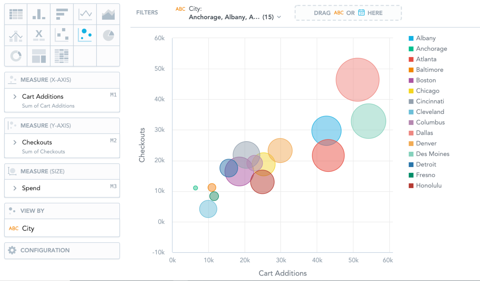
Bubble charts are similar to Scatter plots. They show data points as bubbles using Cartesian coordinates. In addition, bubble charts can display the size of the bubbles in proportions using a third measure. If you add an attribute to the View by section, the bubbles get different colors for each attribute value.
Bubble charts have the following sections: Measure (X-axis), Measure (Y-axis), Measure (Size), View by, and Configuration.